---
title: "Customise the picker"
description: "Every knob on the ready-made Flutter picker: theme modes, colour schemes, style slots, chrome switches, layout sizes, strings, builders, and callbacks."
---
This is rung 2 of the [three ways in](/buyer-sdk/flutter): the same
`SeatLayerPicker` widget, changed to look and read like your product. Nothing
here requires you to lay out a single widget.
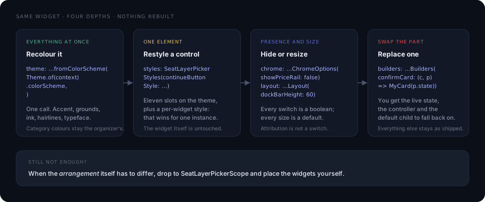
Every parameter below is accepted by `SeatLayerPicker`,
`SeatLayerPickerPage`, `showSeatLayerPicker`, and `SeatLayerPickerScope` alike.
## The parameters at a glance
| Parameter | Type | Default | What it changes |
| --- | --- | --- | --- |
| `configuration` | `SeatLayerConfiguration` | required | Event, credentials, currency |
| `onCheckout` | `SeatLayerCheckoutCallback` | required | Where the hold is handed off |
| `themeMode` | `SeatLayerThemeMode` | `.auto` | Light or dark side |
| `theme` | `SeatLayerPickerThemeData?` | `null` | Colours, radii, typeface, sizes, style slots |
| `options` | `SeatLayerPickerOptions` | `const …()` | Behaviour, chrome switches, strings, haptics |
| `builders` | `SeatLayerPickerBuilders` | `const …()` | Replacements for individual parts |
| `callbacks` | `SeatLayerPickerCallbacks` | `const …()` | Everything that happens, reported |
| `controller` | `SeatLayerPickerController?` | `null` | Drive the picker from your own code |
| `onClose` | `VoidCallback?` | `null` | The buyer dismissed it |
## Recipes
Each recipe is complete on its own — combine as many as you need.
### Brand it from your app's colours
```dart
SeatLayerPicker(
configuration: configuration,
theme: SeatLayerPickerThemeData.of(context),
onCheckout: openCheckout,
)
```
`.of(context)` reads your `Theme.of(context).colorScheme` and body typeface;
`.fromColorScheme(scheme)` takes a scheme you build yourself. Either way
`primary` and `onPrimary` become the accent and its ink, so `Continue`,
`Select`, `Find N best seats`, the hold pill, and the Map/3D control all carry
your brand at once, while `surface`, `onSurface`, `onSurfaceVariant`,
`outlineVariant`, and `error` become the grounds, ink, hairlines, and failures.
Because a `ColorScheme` is a complete ground palette, this pins the picker to
the side that scheme is on — which is what you want, since it came from your
theme, and `.of(context)` follows your own dark-mode switch on rebuild.
### Brand it with one colour, and keep following the device
```dart
SeatLayerPicker(
configuration: configuration,
themeMode: SeatLayerThemeMode.auto,
theme: const SeatLayerPickerThemeData(accent: Color(0xFFE54558)),
onCheckout: openCheckout,
)
```
The default constructor sets only the roles you name, so every ground role still
comes from `themeMode`. Use it when you want a brand accent *and* live light and
dark.
### Square off one button, keep the rest
```dart
theme: SeatLayerPickerThemeData.light(
styles: SeatLayerPickerStyles(
continueButtonStyle: FilledButton.styleFrom(
shape: const RoundedRectangleBorder(),
),
),
),
```
Or restyle that one instance where it is placed, which wins over the theme:
```dart
SeatLayerDockBar(
style: const SeatLayerSurfaceStyle(shape: RoundedRectangleBorder()),
)
```
### Hide the price legend
```dart
options: const SeatLayerPickerOptions(
chrome: SeatLayerPickerChromeOptions(showPriceRail: false),
),
```
### Replace the confirm card with your own
```dart
builders: SeatLayerPickerBuilders(
confirmCard: (context, part) => MyConfirmCard(
state: part.state,
controller: part.controller,
fallback: part.defaultChild,
),
),
```
The builder receives the immutable state, the live controller, and the widget
the drop-in would have rendered — so you can decorate the default, or ignore it
and draw your own, calling `part.controller.selectObjects([...])` yourself.
### Speak the buyer's language
```dart
options: SeatLayerPickerOptions(
strings: SeatLayerPickerStrings.forLocale(Localizations.localeOf(context)),
),
```
### Reword one line
```dart
options: SeatLayerPickerOptions(
strings: SeatLayerPickerStrings(
holdAndCheckout: 'Réserver et payer',
seatsLeft: (count) => '$count restants',
),
),
```
### Ship dark only
```dart
SeatLayerPicker(
configuration: configuration,
themeMode: SeatLayerThemeMode.dark,
theme: const SeatLayerPickerThemeData.dark(accent: Color(0xFFFF5A6F)),
onCheckout: openCheckout,
)
```
### Everything at once
```dart
SeatLayerPicker(
configuration: configuration,
themeMode: SeatLayerThemeMode.auto,
theme: SeatLayerPickerThemeData.light(
accent: const Color(0xFFE54558),
onAccent: Colors.white,
radius: 14,
buttonRadius: 0,
fontFamily: 'YourSans',
layout: const SeatLayerPickerLayout(dockBarHeight: 60),
styles: SeatLayerPickerStyles(
continueButtonStyle: FilledButton.styleFrom(
shape: const RoundedRectangleBorder(),
),
),
),
options: SeatLayerPickerOptions(
chrome: const SeatLayerPickerChromeOptions(showPriceRail: false),
strings: SeatLayerPickerStrings.forLocale(Localizations.localeOf(context)),
),
builders: SeatLayerPickerBuilders(
cartSheet: (context, part) =>
MyOwnSheet(state: part.state, fallback: part.defaultChild),
),
callbacks: SeatLayerPickerCallbacks(
onSeatSelected: (seat) => analytics.log('seat', seat.label),
),
onCheckout: openCheckout,
)
```
## Theme modes
`themeMode` takes `SeatLayerThemeMode.auto`, `.light`, or `.dark`. The resolved
side travels to the renderer alongside the map's new ground, so a flip re-inks
the drawn venue in place — keeping the selection, the focused section, and the
camera. There is no reload.
**Precedence: an explicit `themeMode`, then your app's theme, then the device.**
From `0.3.1`, `auto` reads `Theme.of(context).brightness` first — the switch a
buyer actually moves inside your app, which a Cupertino theme reports too — and
falls back to `MediaQuery.platformBrightness` only where there is no Material or
Cupertino theme above the picker. Both readings are live.
`SeatLayerPickerCallbacks.onThemeResolved` reports the side that won.
From `0.3.1` the picker also dresses the device's status and navigation bars
from the resolved palette, because that surface is the picker's, and forces the
dark style for the immersive 3D scene whatever side the picker is painted on.
Opt out with `SeatLayerPickerChromeOptions(manageSystemOverlays: false)`;
`seatLayerPickerOverlayStyle(resolvedTheme)` is exported so a host that opts out
can still ask what the picker would have set.
## `SeatLayerPickerThemeData`
Every field is optional. Unset roles come from the resolved mode.
| Field | Type | Role |
| --- | --- | --- |
| `accent` | `Color?` | Primary actions, hold pill, active controls |
| `onAccent` | `Color?` | Ink on the accent |
| `background` | `Color?` | The recessed page behind the chrome |
| `surface` | `Color?` | Cards, sheets, bars |
| `text` | `Color?` | Primary ink |
| `mutedText` | `Color?` | Secondary ink |
| `divider` | `Color?` | Hairlines |
| `error` | `Color?` | Failures and recoverable errors |
| `warning` | `Color?` | Commercial warnings on ticket lines |
| `fontFamily` | `String?` | The chrome's typeface |
| `radius` | `double?` | Cards, sheets, surfaces |
| `buttonRadius` | `double?` | Every action, as its own role |
| `logo` | `ImageProvider?` | Header mark |
| `mapTheme` | `SeatLayerMapThemeData?` | The drawn canvas, row labels, selection ring |
| `layout` | `SeatLayerPickerLayout?` | Every size |
| `styles` | `SeatLayerPickerStyles?` | Per-element style slots |
Constructors: the default one above, the `.light()` and `.dark()` presets,
`.fromColorScheme(scheme)`, and `.of(context)`.
`buttonRadius` is its own role rather than a fraction of `radius`, so
`SeatLayerPickerThemeData.light(radius: 20)` rounds the cards and sheets without
growing pill actions. Actions default to 8 logical pixels, which is what the web
picker's own buttons measure; exactly three things stay true pills — the hold
countdown, the price-legend chips, and the Map/3D segmented control.
## Style slots
| Slot | Type | Applies to |
| --- | --- | --- |
| `primaryButtonStyle` | `ButtonStyle?` | `Select`, `Find N best seats`, primary actions |
| `secondaryButtonStyle` | `ButtonStyle?` | `Cancel`, `Back to venue`, secondary actions |
| `continueButtonStyle` | `ButtonStyle?` | `Continue` and `Hold seats & checkout` |
| `iconButtonStyle` | `ButtonStyle?` | Round map and stepper controls |
| `chipShape` | `OutlinedBorder?` | Chip shape across the picker |
| `legendChipStyle` | `SeatLayerSurfaceStyle?` | Price-legend chips |
| `floorStripStyle` | `SeatLayerSurfaceStyle?` | Floor chips |
| `dockBarStyle` | `SeatLayerSurfaceStyle?` | The dock under the map |
| `confirmCardStyle` | `SeatLayerSurfaceStyle?` | The seat decision card |
| `sheetStyle` | `SeatLayerSurfaceStyle?` | The cart sheet |
| `headerStyle` | `SeatLayerSurfaceStyle?` | The header line |
| `pillStyle` | `SeatLayerSurfaceStyle?` | The hold countdown pill |
| `seatViewChromeStyle` | `SeatLayerSurfaceStyle?` | The seat-view caption strip |
Button slots take a Material `ButtonStyle`. Surface slots take a
`SeatLayerSurfaceStyle`, whose fields are `color`, `shape`, `elevation`,
`padding`, and `textStyle`. Every widget that owns a slot also accepts a
`style:` parameter, which wins over the theme for that one instance.
## `SeatLayerPickerLayout`
Every number in the design is a default, not a constant.
| Field | Default | Field | Default |
| --- | ---: | --- | ---: |
| `phoneBreakpoint` | 640 | `confirmCardGutter` | 16 |
| `wideBreakpoint` | 840 | `confirmCardMaxWidth` | 360 |
| `headerHeight` | 56 | `confirmIdentityHeight` | 44 |
| `headerLogoSize` | 28 | `confirmPhotoHeight` | 64 |
| `dockBarHeight` | 52 | `confirmActionHeight` | 40 |
| `peekHeight` | 50 | `selectorHeight` | 40 |
| `sheetMaxHeightFraction` | 0.6 | `accessibilityControlSize` | 44 |
| `emptyTrayMaxHeight` | 150 | `mapControlSize` | 36 |
| `denseLineHeight` | 40 | `attributionHeight` | 18 |
| `denseVisibleLines` | 5 | `legendChipFontSize` | 11 |
## `SeatLayerPickerChromeOptions`
| Switch | Default | Hides |
| --- | --- | --- |
| `showHeader` | `true` | The event header line |
| `showPriceRail` | `true` | The price legend |
| `showFloorSelector` | `true` | The wide-layout floor selector |
| `showFloorStrip` | `true` | The phone floor chips |
| `showMapControls` | `true` | All corner map controls |
| `showOverviewControl` | auto | The explicit overview button |
| `showZoomControls` | auto | The zoom pair |
| `showZoomToFitControl` | `true` | Fit to screen |
| `showViewModeControl` | `true` | The Map/3D segmented control |
| `showColorblindControl` | auto | The colorblind toggle |
| `showAccessibilityControl` | `true` | The accessibility sheet |
| `showTicketPanel` | `true` | The cart panel |
| `showDockBar` | `true` | The dock under the map |
| `showConfirmCard` | `true` | The seat decision card |
| `showVenue3DChrome` | `true` | The 3D scene's own chrome |
| `showSeatViewChrome` | `true` | The native seat-view caption |
| `showHoldPill` | `true` | The hold countdown |
| `manageSystemOverlays` | `true` | Status and navigation bar styling |
The three marked *auto* default to hidden on a phone and shown on a wide layout —
pinch already zooms, and the colorblind palette moved inside the accessibility
sheet. Pass an explicit boolean to override.
Hiding `showSeatViewChrome` does not hand the words back to the runtime, which
was asked at the handshake to stop drawing them, so a host that hides it owns
the disclosure itself.
## `SeatLayerPickerOptions`
| Field | Type | Default | Meaning |
| --- | --- | --- | --- |
| `layout` | `SeatLayerPickerLayoutMode` | `.adaptive` | Force `.compact` or `.wide` |
| `holdTtl` | `Duration?` | `null` | Request a hold window |
| `initialHoldId` | `String?` | `null` | Restore a host-owned hold |
| `readOnly` | `bool` | `false` | Inspect without changing inventory |
| `confirmSelection` | `bool` | `true` | Require the confirm card |
| `enableBestAvailable` | `bool` | `true` | Offer Best Seats |
| `enable3D` | `bool` | `true` | Offer the immersive venue scene |
| `enableSeatView` | `bool` | `true` | Offer the view from a seat |
| `max3DSeats` | `int?` | `null` | Cap 3D by seat count |
| `hideEventDetails` | `bool` | `false` | Drop the event identity line |
| `panelInitiallyCollapsed` | `bool` | `true` | Open on the peek |
| `persistColorblindPreference` | `bool` | `true` | Remember the palette choice |
| `chrome` | `SeatLayerPickerChromeOptions` | `const …()` | The switches above |
| `languages` | `List` | `const []` | Offer a language switch |
| `pricing` | `SeatLayerPickerPricing?` | `null` | Price display overrides |
| `strings` | `SeatLayerPickerStrings` | `const …()` | Every buyer-facing word |
| `haptics` | `bool` | `true` | Feedback on selection and expiry |
## Strings and locales
`SeatLayerPickerStrings` is a plain value class: every buyer-facing word is a
field you can override. Most are `String` — `close`, `chooseSeats`, `overview`,
`cancel`, `select`, `viewFromHere`, `venue3D`, `openVenue360`, `backToVenue`,
`bestSeats`, `holdAndCheckout`, `accessibility`, `fitVenue`, `mapView`, `retry`,
`applyFilters`, `undo`, `allFloors`, and more — and a few are functions, because
they take a value:
```dart
final String Function(int count) ticketCount;
final String Function(int count) seatsLeft;
final String Function(int count) seatsFree;
final String Function(int count) findBestSeats;
final String Function(int count) moreCount;
final String Function(String money) fromPrice;
final String Function(String money) continueWithTotal;
final String Function(String clock) heldFor;
final String Function(List parts) seatIdentity;
```
`accessNeeds` is a `Map` of access-need labels.
`SeatLayerPickerStrings.forLocale(locale)` returns the same reviewed wording the
drawn map uses, across **37 languages**. It resolves by language, and by script
for Chinese. An untranslated locale — and any single entry the runtime has no
wording for — keeps its English default, and the result is an ordinary
`SeatLayerPickerStrings`, so you can still override any entry on top of it:
```dart
final strings = SeatLayerPickerStrings.forLocale(
Localizations.localeOf(context),
);
// then override just the one line you word differently
```
`allFloors` is the one string the runtime has no dictionary entry for and keeps
English in every locale until it does — override it if you ship a multi-floor
venue in another language.
## Motion and haptics
Every animation spends a duration from `SeatLayerPickerMotion` — `enter`,
`exit`, `dock`, `sheet`, `fly`, `pop`, `stagger`, `crossfade`, `toast`,
`immersive`, and `undoWindow` — and every one of them collapses under
`MediaQuery.disableAnimations`, so a buyer's reduced-motion preference is
honoured without a setting of yours.
Haptics are one switch, `SeatLayerPickerOptions(haptics: false)`. The cues are
`PickerHapticCue.selectionAdded`, `.sectionFocused`, `.holdCreated`, and
`.holdExpired`; the last fires from the runtime's own expiry signal rather than
a local timer.
## Callbacks
All optional, all on `SeatLayerPickerCallbacks`.
| Callback | Payload | Fires when |
| --- | --- | --- |
| `onReady` | `ReadyInfo` | The chart is ready |
| `onSelectionChanged` | `List` | The selection changes |
| `onSelectionValidityChanged` | `SelectionValidity` | Validation state changes |
| `onSeatSelected` | `SelectedSeat` | A seat is added |
| `onSeatRemoved` | `String` | A seat is removed |
| `onSectionFocused` | `String` | A section is focused |
| `onSeatViewOpened` | `SelectedSeat` | The view from a seat opens |
| `onHoldChanged` | hold and handoff | A hold is created or replaced |
| `onHoldExpired` | — | The server expired the hold |
| `onContinue` | `SeatLayerCheckoutHandoff` | Checkout is confirmed |
| `onThemeResolved` | `Brightness` | The resolved side changes |
| `onAccessExpired` | `BuyerAccessExpiredEvent` | Buyer access lapsed |
| `onAccessUnavailable` | `BuyerAccessUnavailableEvent` | Access could not be granted |
| `onSelectedObjectUnavailable` | `SelectedObjectUnavailableEvent` | A held seat was taken |
| `onError` | `SeatLayerError` | A recoverable action failed |
| `onClosed` | `SeatLayerPickerCloseReason` | The picker closed |
## Builder slots
Each takes `Widget Function(BuildContext, SeatLayerPickerPartContext)`, and the
part context carries `state`, `controller`, and `defaultChild`.
`header`, `priceRail`, `legend`, `sectionNavigator`, `floorStrip`, `dockBar`,
`accessibilityFilters`, `map`, `mapControls`, `bestAvailable`,
`seatConfirmation`, `confirmCard`, `generalAdmissionPrompt`, `tablePrompt`,
`selectionTray`, `cartSheet`, `venue3D`, `seatViewChrome`, `holdCountdown`,
`actionError`, `checkoutBar`, `loading`, `error`, and `empty`.
The overall adaptive layout, the test marker, and the required attribution
deliberately have no builder: theme colours and typography stay customisable,
but required chrome cannot be hidden by returning an empty widget.
## Next steps
- [Build your own layout](/buyer-sdk/flutter/custom-layout)
- [Understand the architecture](/buyer-sdk/flutter/architecture)
- [Back to the Flutter quick start](/buyer-sdk/flutter)